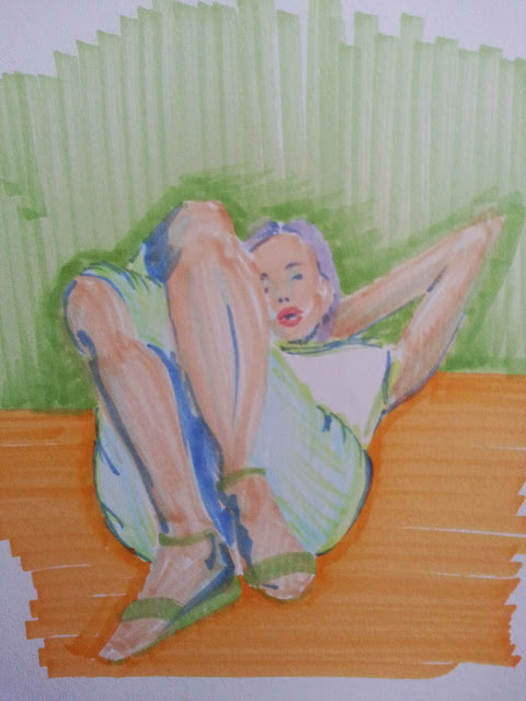
Had some time at work a couple of weeks ago and did a quick sketch. It was nice to see that I haven't totally lost it. It kinda reminds me of things I used to do in high school. Very stiff. Need to keep at it. My lose is too lose and my stuff is too stiff. Gota find that middle ground.
Wednesday, December 24, 2014
Angel sketch
Friday, November 14, 2014
Saturday, November 8, 2014
Reclining woman
So my thing lately, is to copy images I see. Not to claim them as my own but to study light, composition, color theory... I'm enjoying it a lot. I need to do this on a daily basis and keep posting.
Monday, September 1, 2014
Pencil city sreet
A quick pencil sketch from memory/imagination of a cityscape. A little rusty on my perspective
But I think I did a good job nonetheless. Need to keep practicing though.
Monday, August 18, 2014
Fierce Women
I decided to finally go back and use some of the pictures that I'm collecting in my Art Reference pinterest board.
I'm still struggling with getting myself creating more art. So I'll keep posting and hopefully that'll inspire me to keep producing.
Tuesday, July 29, 2014
Thursday, June 12, 2014
Color studies 2: Prince of Egypt
Continuing with the theme of color studies I did a marker rendition of a color study that was used for the movie "The Prince of Egypt" by Dreamworks. I remember watching that movie and being amazed by the level of animation produced. I had at that point begun to become jaded by Disney animation and feeling that all those proclamations of "animation is dead" were true. This movie blew my mind and remember thinking "Disney is back" and then "Holy S#!% this isn't Disney!". I was blown away and pulling out this art of book after all those years just reinforced that idea. The art direction in this movie is amazing and more films need to be made with this level of dedication, details, and love.
Sorry to gush. I was really impressed.
Going back to color studies, I was using my limited palette of handy Copic markers. I usually try to buy a limited palette of them to carry with me. I sometimes feel having a full palette makes you lazy. Not think of how colors are created, how they look next to each other, how they can create different moods. I'm trying to think more about how I use color. I'm obsessed. And trying to draw my own subjects sidetracks me. I'm happy with the way this came out.
Thursday, June 5, 2014
Color Studies
Wednesday, June 4, 2014
Value Studies
Friday, May 30, 2014
Seaside Sorceress Tower Keep
Thursday, May 29, 2014
Monday, May 26, 2014
Wednesday, March 5, 2014
Stone walls
So I've been doing a lot more painting for the show and I needed to take foam carved walls and make them look like ancient temple stone walls. After priming them white, I have them a base layer of warm grey. After that it was just a matter of dirtying then up and throw on some highlights. I had loads of fun doing it. Hope you enjoy.
Friday, February 7, 2014
Environmental Design
Through my studio in able to take 2 courses I would otherwise be unable to attend. One is environmental design. It's mostly photoshop shortcuts in the use of concept drawings, but it's still very helpful. I'm enjoying myself. On my first day we all used the same reference photo to learn said techniques and this is what came out of it for me. He's making us work exclusively in values and not color to help us focus on silhouette and composition. I think that's very smart. I do love how creepy it came out. I guess I'm just that kind of girl.
.gif)


